Designing Metrix
Devising a way to understand audiences like never before
Project description:
Metrix is a web-based research platform I designed and built to solve a fundamental problem in audience research: existing tools capture either what people feel in the moment, or what they remember afterwards, but never both together.
I created Metrix to bridge this gap. Metrix is a system that collects real-time sentiment data during live events and automatically links it to post-event feedback on a participant-by-participant basis. The result is a complete picture of audience experience that reveals the gap between what people notice, and what they remember.
Originally developed to support my doctoral research on audience perception, I have since expanded Metrix's design into a full SaaS platform, adding features like study management, multi-user support, and data visualization tools. The goal is to release this as an open-source tool that can serve researchers, event producers, and audience analysts across industries.
Role:
Product designer, UX designer, full-stack developer
Introduction
Studying audience response to live performance has always involved a trade-off: Real-time data tells us when something happened, but not why, and post-event data (such as interviews and surveys) tell us what people think happened, but memory is unreliable and people forget what they noticed in the moment.
For my doctoral research on how audiences perceive performance errors, I needed both. But no tool existed that could do all of the following:
- Capture in-the-moment reactions during live events
- Link those reactions to individual post-event responses
- Scale to 75+ simultaneous users
- Work on any smartphone without installing apps
- Provide researchers with real-time control and monitoring
So, I designed and built Metrix from scratch. It started as a research tool for my PhD, and since I have evolved it into a platform that can serve any researcher studying live audience experience.
Designing a tool for real-time data collection
For the real-time half of this kind of audience study, I needed software that would do the following:
- Interface needs:
- Provide a simple interface for study participants to provide real-time feedback during music performances
- Be suitable for use in a darkened performance space without being distracting
- Be as frictionless as possible for the audience to learn
- Technical needs:
- Operate on any smartphone with a browser
- Continuously collect and store data with a unique identifier for each participant, so I could link their real-time and post-hoc responses later
- Support up to 75 simultaneous connections (the capacity of the concert theatre)
- Operational needs:
- Provide the investigator (me) a control interface for controlling when the data collection was activated
There were no tools on the market that could do this, which was surprising, considering how ubiquitous smartphones had already become and how little research existed in this real-time space. It was on me to build something to bridge this gap.
The public-facing interface
I designed the public-facing study interface with the following in mind:
- It needed a simple interface for study participants to provide real-time feedback during performances
- It had to be suitable for use in a darkened performance space without being distracting
- It should be as frictionless as possible for the audience to learn
A two-button solution
For simplicity I used a two-button interface that only required simple taps. Sliders, text, or other interfacce complexity risked distracting attention away from the performance. The two large buttons provided a way to indicate to perceived states:
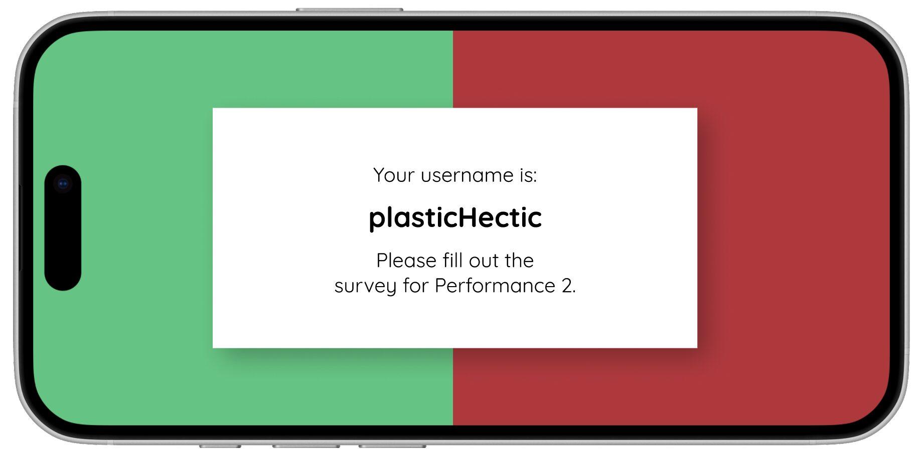
“I’m enjoying this” - indicated by a green side with a ":)" icon
“I heard an error" - indicated by a red side with an "X" icon
I chose colours that were dark enough to be visible on an individual phone, but not visible to others or the performers. The audience learned to use the app in a very short onboarding session with a practice round.
Other than the colours and symbols the interface was totally featureless so there was nothing to look at, except for a subtle colour change on tap to indicate that the tap had been recorded.


Generating identifiers
One of the most important parts of Metrix was that it had to provide a way of aligning real-time and post-hoc data, on a participant-by-participant basis. The way Metrix does this is by generating usernames.
When a participant connects to the site, they're asked to enter the study. Metrix then generates a username from two randomly-selected words. This username is displayed on the screen between performances when participants are asked to fill out written surveys, so they can write their usernames on their survey book.
Design iteration
I was concerned about the red/green interface, wondering if this was creating a binary relationship between the questions, but wanted to provide some easy-to-perceive reminder of which side was for which indication. I was also concerned that the ":)" and "X" indicators were too abstract, but again, removing them seemed wrong.
The data from the first study indicated that participants often tapped both buttons at once, suggesting they understood that enjoyment and error weren't mutually exclusive. Participants were also asked for feedback on Metrix and there were no indications that it was confusing. However, this was a crucial thing to get right so I held a 20-person focus group and did some heuristic testing.
The focus group indicated that they didn't find the symbols to be confusing, but there was some not-insignificant feedback that the red/green colours were suggesting a binary relationship. Based on this feedback I designed a grey version for the following study.
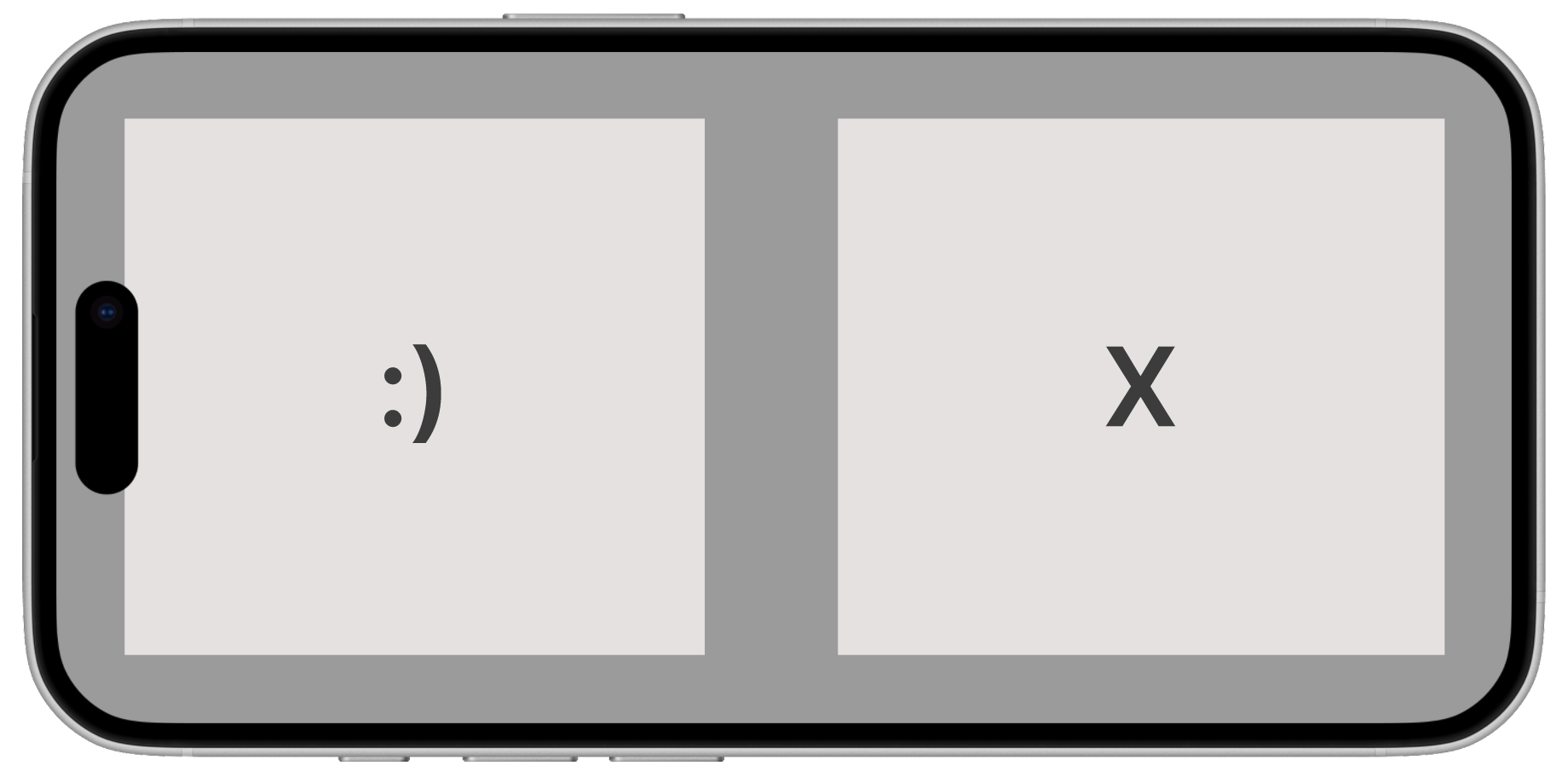
In the following study I asked participants for feedback. They overwhelmingly indicated that the grey interface made it difficult to rememebr which side was associated with which question, and they found this confusion distracting, so ultimately I used the red/green interface going forward. I did, however, add a segment to the 10-minute onboarding where I clarified that this interface is asking them two different questions, not asking them to indicate either side of a binary phenomenon.
Meeting technical requirements
The technical requirements were:
- Operate on any mobile phone
- Continuously collect and store data with a unique identifier for each participant, so I could link their real-time and post-hoc responses later
- Suport up to 75 simultaneous client connections
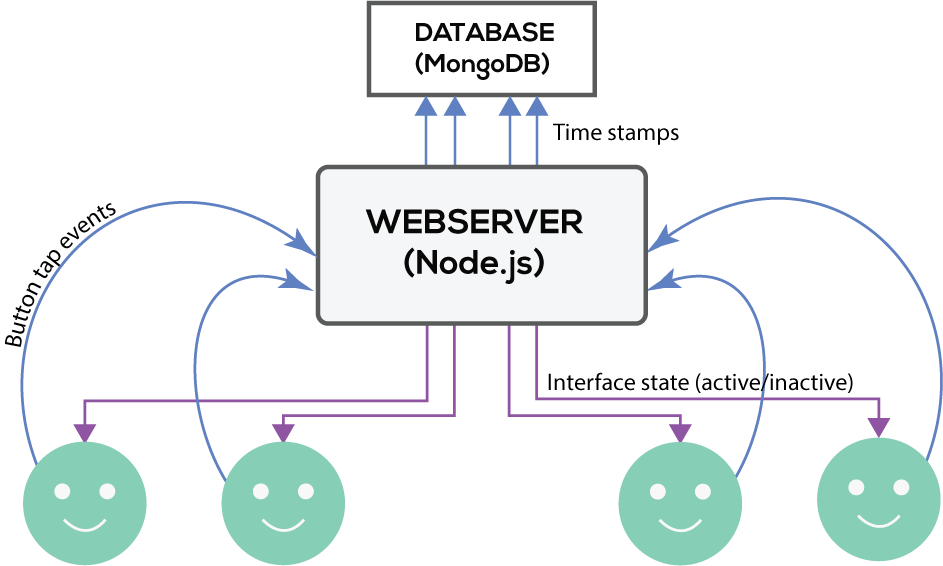
Metrix is a web app built using Node.js that runs on a virtual private server (VPS). Metrix’s interface is designed and implemented using HTML, CSS and JavaScript. Metrix communicates with connected devices using web sockets, implemented using the JavaScript library Socket.io.
When the participant's interface is active, they can tap the two buttons. Button tap data is sent from the participant devices to Metrix through asynchronous HTTP POST requests, and Metrix in turn stores that data in a database built with MongoDB, a non-relational database that stores data in JSON-like documents.
Metrix also has a control interface so the investigator can make participant interfaces active and inactive remotely. This allowed me to start collecting data at the beginning of the performance (and timestamping that start), and made all participant interfaces active. At the end of the performance I could end collection, and paticipant interfaces would display their username for filling out a short written survey.
Designing the control interface
An important part of Metrix is the control interface, that allows the investigator to make participant devices active (when data is being collected) and inactive (when the participants' usernames are displayed on their devices and no data is collected).
At the time this was just a web page with a few buttons, but since my doctoral research I've built out this idea significantly to visualise Metrix as a SaaS product that would support this kind of research.
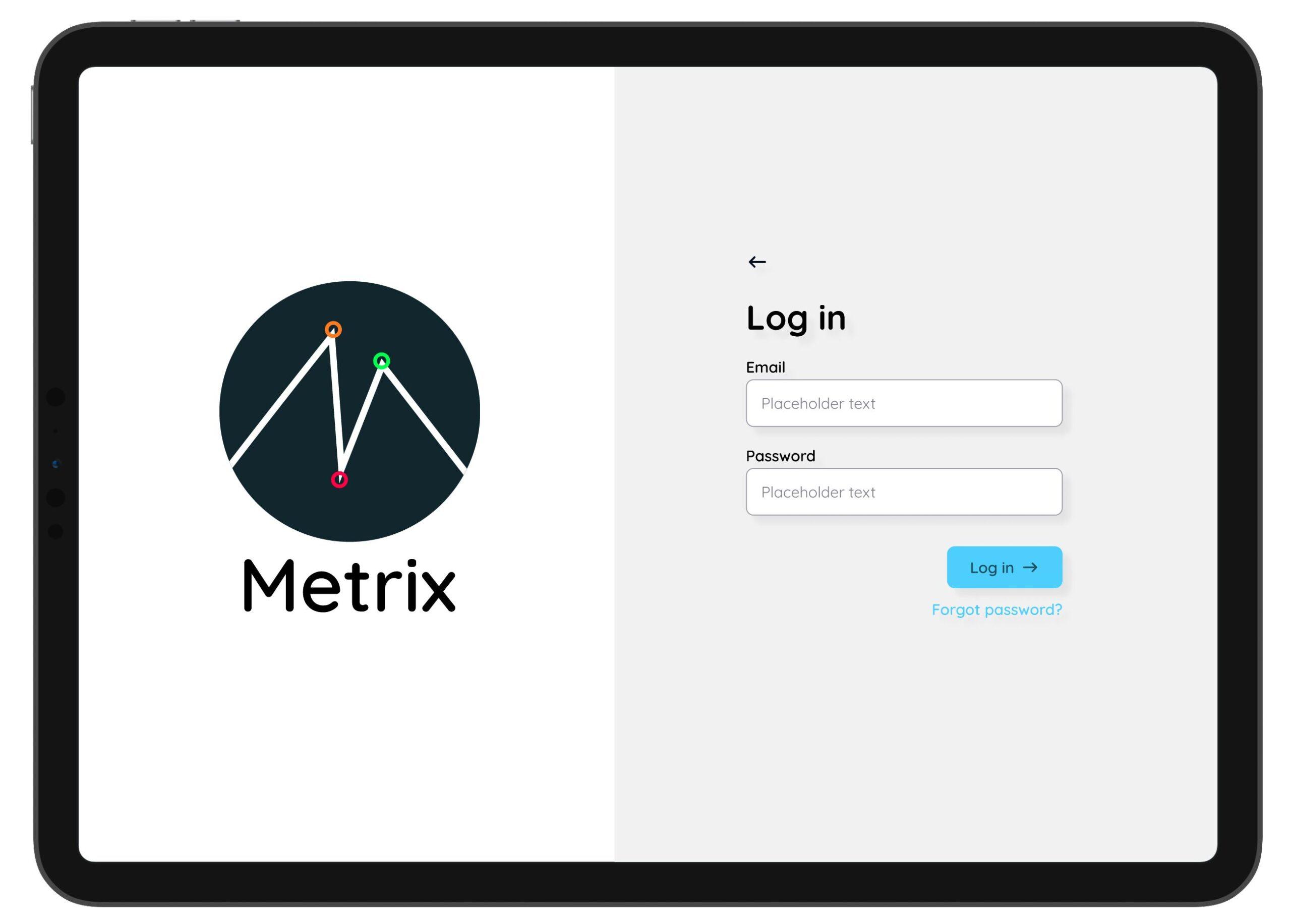
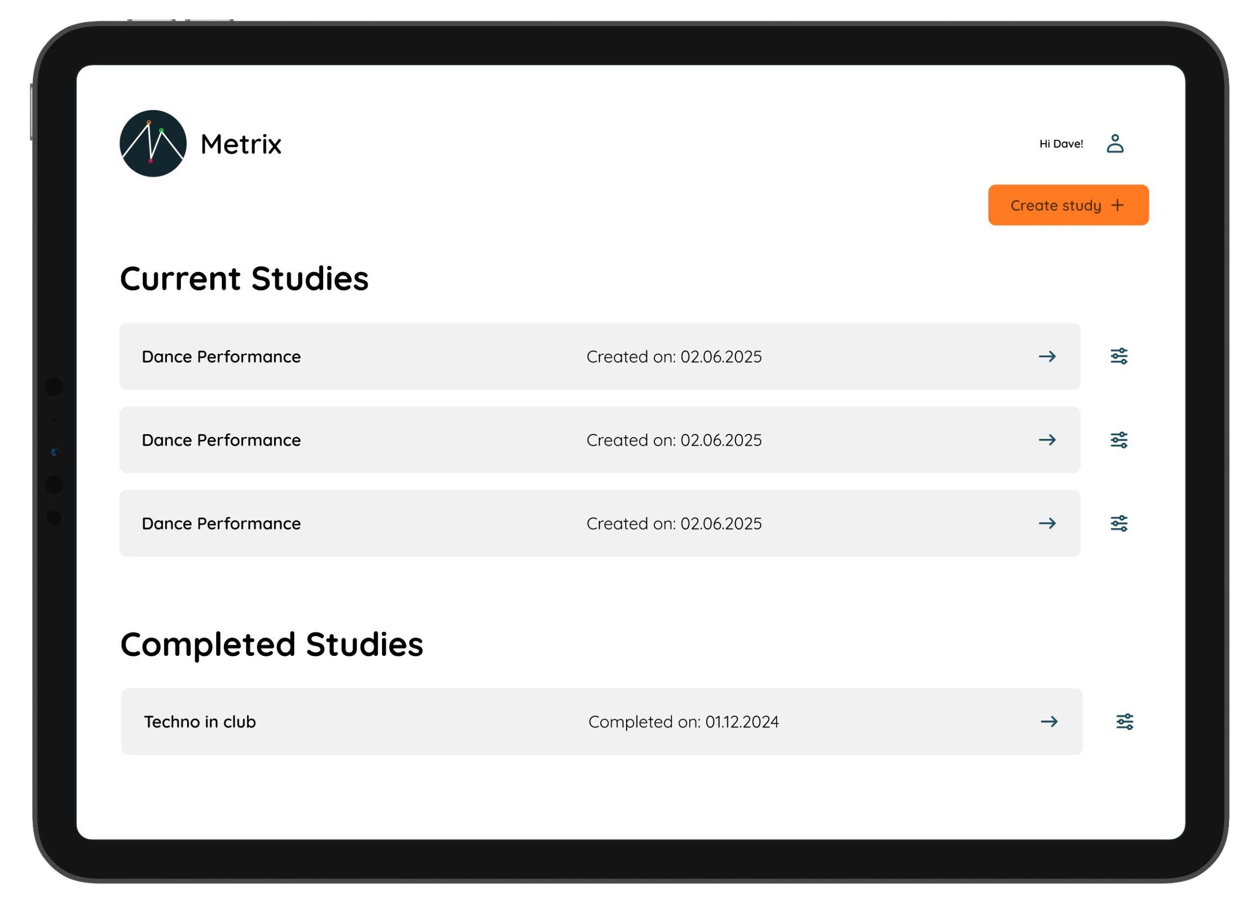
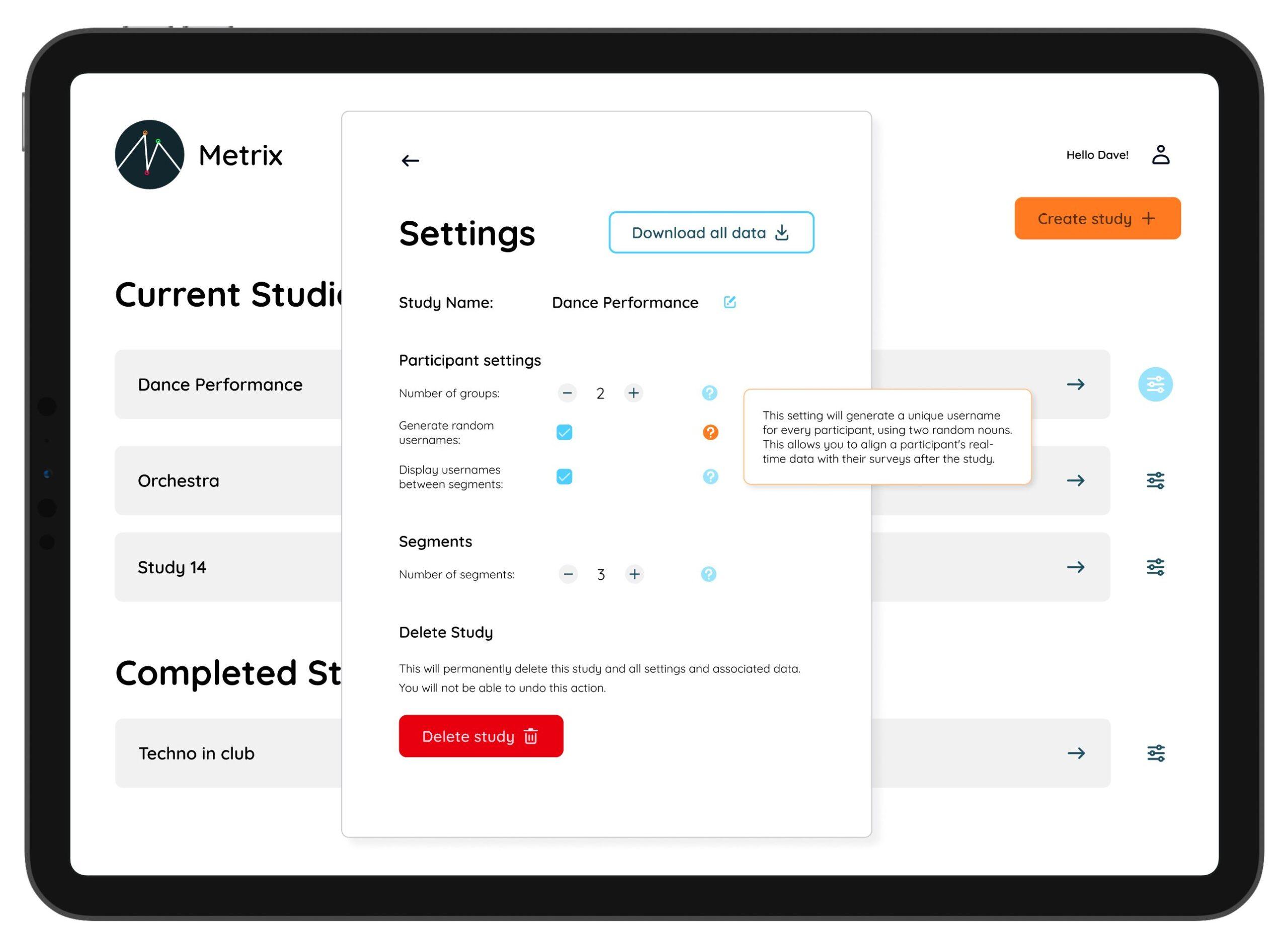
After logging in, Metrix presents the investigator with the main dashboard, which lists their upcoming studies as well as their completed studies. For each upcoming study the investigator can adjust settings. The settings have tooltips to avoid jargon and provide clarity:
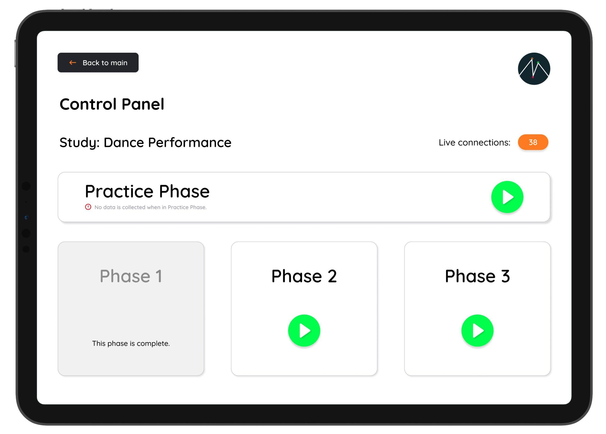
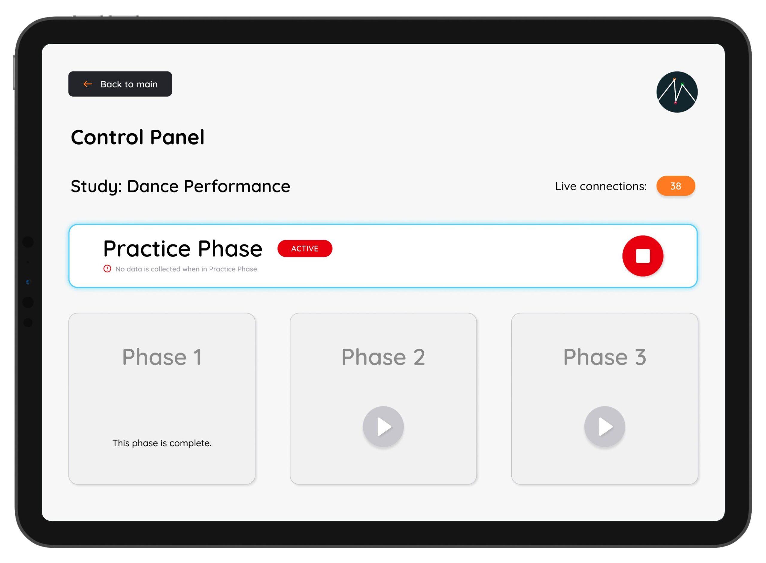
The interface for any given study has a set of control features for the live event, including:
- A live count of the number of connected devices, so the investigator can tell if something is going wrong
- Controls for starting and stopping each segment of a performance (when data is actually being collected)
There's also always a way to start a practice session. This is a state in which participant interfaces are active and they can tap the buttons but no data is collected. I found this to be really important when doing these studies; getting people comformatable with the interface, how it felt, and how to tap the buttons without looking at them was crucial for consistency across all comparitive cases.
In the control interface, the rest of the interface is inactive when a segment (or a practice session) is active.
The outcomes
Metrix formed the basis of my PhD research, which included a novel methodology for studying audiences in real time. I was able to carry out multiple studies that not only examined audience perception of live performance, but also investigated the differences between what we see in the moment and what we say about it afterwards.
The open-source release of Metrix means that researchers now have access to a robust, free tool that bridges the gap between post-hoc and real-time audience data.
Publications
Want to read more about the insights that I gained from using Metrix? Here's some publications:
Bin S M A, Bryan-Kinns N, McPherson AP. "Risky business: Disfluency as a design strategy."
Metrix makes it possible to capture both the moment, and the meaning.
See More