The Bela Brand
Creating and evolving a brand that stands for creative expression and reliable performance

Project description:
As Bela's founding designer, I led the creation and long-term evolution of the Bela brand from its inception through almost a decade of product growth and community expansion. I originated the visual and verbal identity, including logo, typography, colour, proportion systems, and tone of voice, and embedded it consistently across physical hardware, digital interfaces, marketing materials, and technical documentation.
This case study highlights how I shaped Bela's brand as an adaptable yet cohesive communication system that spoke to engineers, artists, educators, and musicians working with real-time embedded audio, and could be adapted to any medium.
Role:
Designer
Introduction
When Bela launched in 2016, it was a bold new platform for ultra-low-latency embedded audio, aimed at creative developers working at the intersection of music and technology. As a new concept in a hybrid space made up of hardware, software, and community, it needed a brand that could be clear yet expressive, technical yet approachable, and built to last.
My challenge was to design a visual and verbal identity that:
- Built immediate trust with people who already had significant technical expertise, but wasn't intimidating for newcomers
- Stood out in the audio/tech/hardware landscape
- Could be adapted across use cases, from circuit boards to websites to product packaging
- Would scale with the company as it evolved
From the outset, I approached the brand as a modular system, one that mirrored Bela's ethos of flexibility, control, and precision. The foundations of this brand had to reflect the values on which we were building this company: clarity, creativity, confidence, and craft.
I audited competitors in adjacent spaces (DIY hardware, audio dev platforms, music technology) to identify where Bela could own a distinctive position. The resulting strategy positioned Bela as a trusted toolmaker for curious minds. Bela is serious enough for professionals, and accessible enough for tinkerers.
The logo
At the heart of the Bela brand is a logo designed to balance technical familiarity with creative openness.
My design objectives:
- Signal technological depth without falling into sterile or aggressive aesthetics
- Stand out in a category often dominated by masculine, minimal, or overly "pro" branding
- Be instantly recognizable in both print and pixel, from etched PCBs to social media icons
For the glyph design I started out by spelling out "Bela" with things I found on my workbench: bending wire into shapes, grouping LEDs, making collages of resisitors. I came across some seven-segment displays, the kind seen on synths, lab gear, and early computing devices. I spelled out the name:

I didn't like the way the B wasn't really distinct from an 8, and how the A's open bottom made it look out of proportion, so I refined the letters:

Then, with a vector drawing, I started to experiment with the middle strokes to give the letter balance and make it less literal as a seven-segment display, and to add reflective vertical symmetry across the glyphs:

Once I had glyphs grounded in a recognizable visual language of electronic hardware, I had to make them look timeless. I pulled from the visual rhythm of neon signage and nixie lights, introducing a sense of lightness and playfulness not typically found in the music tech space.
This fusion gave the logo a unique voice: tech-forward, but never cold. This has enabled it to speak to engineers, artists, musicians and educators alike.
The key features of the Bela logo:
- Segmented strokes recall numeric displays, neon lights, and circuit traces
- Rounded geometry softens the tech references to feel human and approachable
- A strong silhouette ensures legibility and recall at any scale
- Designed to perform across media: screenprint, laser-etch, print, web
This mark became the cornerstone of Bela's brand, appearing not just on websites and packaging, but also as a physical identifier on hardware, breakout boards, stickers, t-shirts, signage and more. It has become a shorthand for trust, inventiveness, and community among Bela's diverse audience. It has been copyrighted since 2016.
Colour
From the start, I made deliberate choices in color and typography to position Bela outside the predictable aesthetic tropes of "music tech" and startup culture. Much of this industry leans into dark palettes, sterile grids, and minimalism. I wanted Bela to feel immediately different without sacrificing clarity or seriousness, and feel open, experimental, and welcoming.
My goals for this colour system were:
- Make Bela stand out instantly in a sea of greyscale gear
- Signal play and experimentation
- Colors must be able to meet contrast requirements for legibility and accessibility
- Be flexible enough to adapt across websites, packaging, marketing, UI, and hardware silkscreening
I built a palette around bright, lively, unconventional hues, made up of shades of teal against neutral whites and greys. There is one main teal (400), with three lighter hues and a darker shade, and all can be used with defined levels of opacity. These colours are fully functional for UI and in web and print contexts, and also have the benefit of not having obvious gender associations.
When designing the Bela IDE I also added accent colours of yellow and red. These are both warm to contrast the cool teal of the logo.

Bela's core group of five colours, as well as the base red and yellow accents, has proven so wide-ranging and flexible across print, digital media and interfaces that they have not changed at all since they were defined. Even when we introduced a dark mode for the Bela IDE, no additional colours were necessary.
The logo most often appears with an infill of Bela 200:
Typography
My goals with choosing the Bela typography:
- Support long-form technical texts without fatiguing the reader
- Create hierarchy and interest across marketing, UI, and packaging
- Maintain a cohesive feel across Bela’s physical and digital spaces
By weaving color and type into every touchpoint, from quick-start guides to websites to print materials to software interfaces, I built a Bela brand language that was both immediately distinctive and quietly trustworthy.
Our title font is Space Mono. Our subtitle font is Space Grotesk. Our body font is Darker Grotesque. The IDE adds Inconsolata for status messages and values.


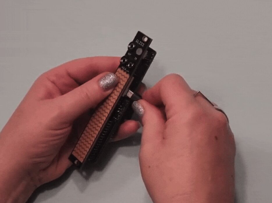
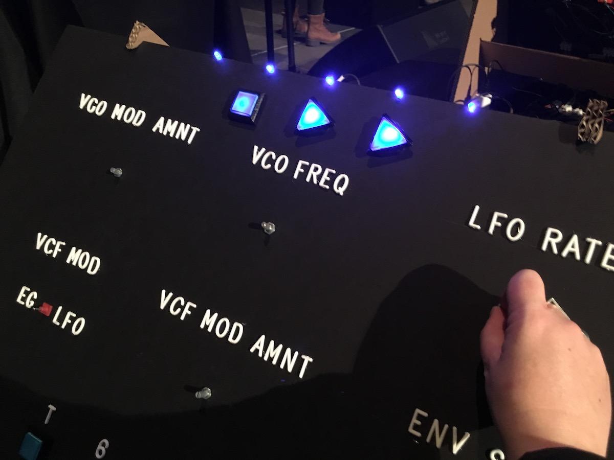
Hardware and physical interfaces
The Bela brand also lives in physical form, etched into metal and PCBs.
I designed branding systems that worked with the constraints and opportunities of small-scale hardware production:
- Silkscreened brand and type systems for breakout boards and Trill sensors
- Proportional balance in busy visual systems at small scale
- Visual consistency across accessories, sensors, and prototypes
These choices weren't just about aesthetics; they enhanced clarity, improved usability, and built recognition in the crowded maker and music technology markets.
I also chose fonts and a visual treatment that was specific to hardware. For our modular products, this font is OCR-A. For Bela Gem, I created a custom font based on an almost-forgotten relic from the early days of Silicon Valley. (That font is called Little Character and will be included in Google Fonts in 2025. You can read the whole story here.)


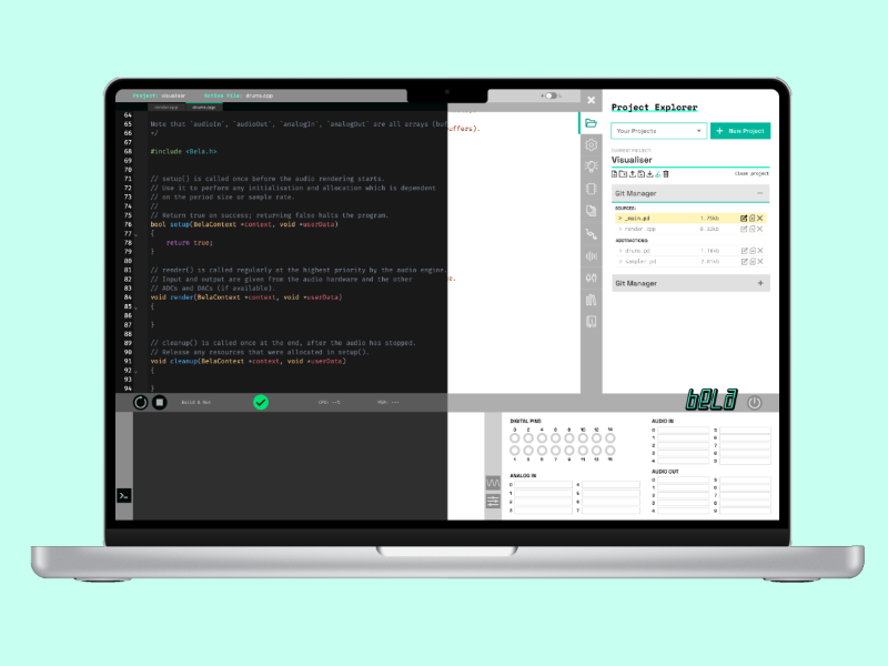
Software tools and interfaces
The Bela interface ecosystem, including web-based tools and the browser-based IDE, required an identity that felt native to developers but approachable to artists.
I translated the brand into UI components that are:
- Functional and readable under varied lighting conditions (e.g. stage vs. lab)
- Minimal but characterful, with thoughtful use of brand colors and custom icons
- Responsive and legible
This wasn't a matter of skin-deep styling. I was deeply committed to visual information hierarchy, interaction clarity, and tone of interface prompts and UX copy, making sure every touchpoint felt like Bela.


The Bela Voice: Documentation and marketing
Beyond visuals, I defined a tone of voice and way of communicating that carried the brand through technical documentation, knowledge base, and marketing content. In keeping with the brand values of "approachable, friendly, credible", the Bela Voice was designed with the following in mind:
- Clear but never condescending
- Accurate but without jargon
- Friendly but always trustworthy
- Technical without gatekeeping
- Witty, with a sense of levity and humour
Whether in product copy, newsletters, error messages, documentation or tutorials, I ensured that Bela spoke with a voice that encouraged experimentation, supported learning, and respected the intelligence and varied experience of the musicians, artists, researchers, engineers, students and experimenters that use it to create beautiful interaction.
I also named the following products:
- Trill (along with the sub-products Bar, Square, Craft, Hex, Ring, Flex and Hub)
- SALT/SALT+
- PEPPER
- Gliss
- Bela Gem


Outcomes and reflections
Over almost a decade of development, the Bela brand became much more than a visual system. It became a signal of trust, experimentation, and craft for a global community of artists, musicians, makers, and educators.
The identity I designed helped:
- Build recognition in a crowded and often homogenous industry
- Attract users from outside the typical "music tech" bubble, including artists, researchers, and educators
- Support a wide range of use cases, from stage performances to university classrooms
- Scale across products and platforms without dilution
Bela is known for releasing quality products that work, that are reliable, whose function and design is fully resolved. I viewed the Bela brand as an expression of this quality, which fuelled my motivation to drive its consistency across every touchpoint, to make sure its voice resonated in every configuration.
The Bela brand is visually distinctive, deeply functional, and emotionally resonant, and this has allowed it to endure over nearly ten years of growth, iteration, and expansion across what is now a vast product family. The Bela brand has scaled gracefully from open-source niche university project to internationally recognisable creative brand, and proves that good design is solid enough to endure, but flexible enough to stretch to new frontiers.
The Bela brand is design not as ornament, but as infrastructure.
See More