The Gliss Manual
Transforming a strip of lights into a learnable instrument, relevant to every synth setup

Project description:
Gliss is a touch control module for Eurorack with an abstract interface of coloured lights. I created a complete documentation system for the Gliss Eurorack module that included a 60-page PDF manual, a foldable cheat sheet, and a full video guide, to make a light-driven interface easy to learn and master.
This work defined the Gliss's vocabulary and nomenclature, guided late-stage interaction design improvements, and ensured synth enthusiasts could access every feature with confidence and apply it to the music they make.
Download the Gliss PDF manual here
Watch the video manual here
Role:
Technical content development; nomenclature design; illustration; graphic design; book production; video production
Introduction
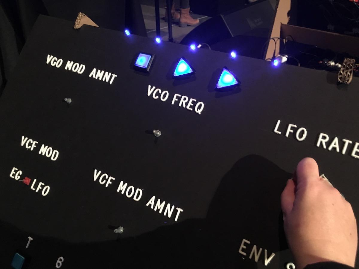
Gliss is a Eurorack synthesizer module built around a touch-sensitive strip, with its menu system displayed entirely through illuminated segments on the strip. Gliss has no printed labels for these functions, no screen, and all of its functionality is buried in four interactive modes.


To make this powerful but minimal interface accessible, I created a complete documentation suite: a 60-page PDF manual, a printable quick-reference cheat sheet, and a video manual. My aim was to create a model for understanding Gliss that makes every feature understandable, from the fundamentals to the most advanced functions, and to ensure that synth enthusiasts can learn, experiment, and troubleshoot confidently and without feeling lost.
This project also required defining Gliss's vocabulary from scratch. I came up with every functional title (Modes, Touch Strip, Top Output, Bottom Output, and so on), refined the mode names and menu items, and made sure that this documentation used consistent, intuitive terminology that people could quickly grasp and remember. That nomenclature became the backbone of both the documentation and the product interface.
Every feature is only as good as a person's ability to understand it. That's what this documentation delivers.
The challenge
Synth modules often compress a huge amount of functionality into a very small interface. Gliss is no exception, as most controls and feedback live entirely on a single illuminated touch strip. The menu system appears as light patterns on the strip itself; there are no printed labels, no dedicated screen, and no physical indicators beyond LEDs.
While this keeps the hardware elegant and minimal, it also means there’s nothing to guide someone who's confronting Gliss for the first time - except for the documentation. Without a clear, detailed, and easy-to-navigate manual, many of Gliss's most powerful features would be ignored, confusing, or misunderstood. For Gliss to succeed, the documentation had to function as the map to the module.

When your interface is just a strip of light, the manual becomes the map.
The audience
The primary audience for the Gliss documentation was people who had already purchased the module, or were considering buying it. These people are already familiar with modular synthesizers, but that doesn't mean they're engineers or programmers; what they all have in common is they're passionate synth enthusiasts with a love for hands-on exploration.
They need explanations that respect their experience without assuming deep technical knowledge or slipping into jargon. The manual had to be accessible enough for someone who just wanted to start patching and experimenting, while also serving as a detailed reference for those looking to understand and master every mode and parameter.

Scope and formats
The core of this documentation system is a fully illustrated 60-page PDF manual that serves as both a step-by-step learning guide and a deep technical reference.
To make a complete menu reference for day-to-day use, I designed a printable cheat sheet that's included in the manual. When printed this sheet folds into a pamphlet that illustrates every menu for every mode, as well as the global menus.
Finally, I produced a video manual for visual learners. This follows the same chapter structure as the written version. The video manual gives people the option to watch the module in action, hear examples, and see the menu behaviour in real time.
By offering three formats, every person can engage with the information in the way that suits them best, whether that was reading, skimming, watching, or a combination of all three.
One manual, three formats: deep manual, quick reference, and video, all telling the same story.
Documentation process and influence on design
I began by breaking the documentation into Gliss's four primary modes: Control, Record, Signal, and Notes. For each mode, I detailed every function in the menu, pairing clear descriptions with precise illustrations.
The manual opened with a general overview of the module, followed by essential setup guidance like voltage range configuration and the global menu functions. At the end is calibration instructions, since accuracy is critical for a performance module.
One of the most valuable parts of the process was how writing the manual shaped the product itself. Whenever I found a feature awkward or impossible to explain, it revealed an underlying problem with the interaction design. These discoveries led to refinements that made Gliss's interface more intuitive before launch, improving the experience of use and reducing potential confusion.
If it's awkward to explain, it's probably awkward to use. Writing the Gliss documentation allowed me to make Gliss better.
Visual system
Gliss already had a defined colour palette, and I leaned on it heavily to create a clear visual language in the manual. Each mode was assigned its own colour (red for Control, gold for Record, green for Signal, orange for Notes), and I carried this through the headings, diagrams, and callouts. Because the module itself has no labels for modes, this colour coding became essential to helping readers map the manual to the hardware.

All module diagrams were built from a master SVG illustration I made of Gliss in both of its orientations, along with a range of coloured selectors. This enabled me to recreate any view of Gliss with total consistency across the entire manual. For the second version of the Gliss manual I added an illustration of the 1U orientation.
I kept the layout was kept clean and structured, with typography factors like type size and line height chosen for both clarity and long-session readability, with all fonts derived from the Bela design system.

I then extended this visual identity to the video, designing and implementing all titles with the same visual style and colour system to create a consistent and seamless experience across both formats. No matter how you engage with the documentation, you always know you're looking at Gliss.

Usability and navigation
60 pages of manual can feel daunting, so I designed the manual to be effortless to navigate.
The chapter structure moves logically through general concepts, to the menu system, to each individual mode, and finally calibration. The PDF includes fully linked navigation in the Table of Contents, so people can jump straight to any chapter without scrolling.
I also made use of colour and design for navigating within the manual. Each mode chapter has a consistent layout, beginning with the mode name in large, colour-coded type, a subtitle describing its purpose, and an illustration of its menu on the right. A persistent header at the top of every page showed which chapter you were in, so even when scrolling you always knew where you were. All callouts and diagrams use that mode's colour in order to constantly reinforce its meaning.

For quick reference, I designed a foldable cheat sheet summarising every menu function across all modes, easy to print and keep next to your modular setup.
Post-release, feedback from Gliss owners led to small refinements in both wording and diagrams. For the updated manual supporting Firmware V2, I updated all content to cover the new features, as well as explain the new Gliss 1U hardware format. This update wasn’t just an add-on to the existing manual, but rather a product expansion that included new illustrations, significant updates to mode explanations, and expanded voltage range details, all while preserving the structure and navigation that Gliss owners already knew.
Sixty pages can still feel light when the structure works with you.
Video version and extensions
To make the Gliss documentation even more accessible, I led the creation a full video manual that mirrored the structure of the PDF: general overview, menu system, each mode, and calibration.
As well as being part of the script writing team to translate the written document to scenes that could be filmed, I also led production. I designed the set and lighting, keeping the feeling of the video bright and calm, in line with all public-facing Bela communication. As part of the production design I made the stylistic choice to have woman-coded hands with manicured nails operating the synth, because women and non-binary people are vastly under-represented in the modular synth space.
On-screen graphics matched the style of the manual through font, colour and layout, so the video feels like a natural extension of the printed and digital materials. This format lets people see Gliss in action, hear audio examples, and watch the menu system respond in real time.
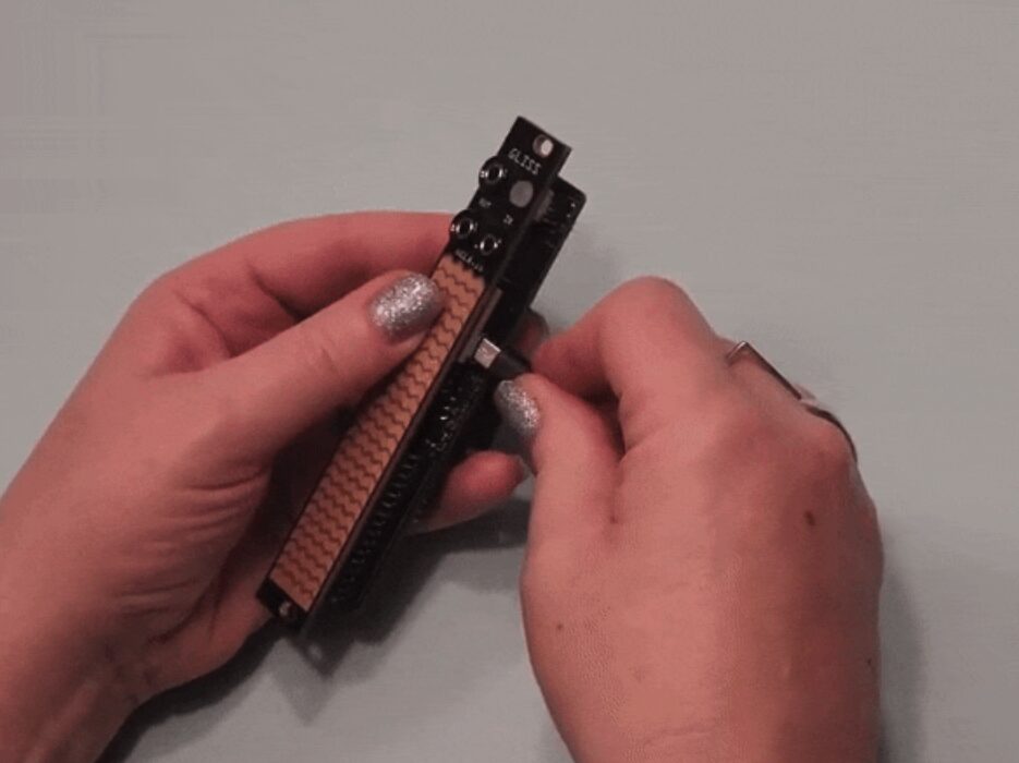
Another important production choice was adding an iPad Mini at the top of the setup that was visualising the Gliss signal response. This is because it's generally difficult to visualise precisely what's happening with signals merely by being told, even for experts. I did this by connecting all to a Bela-powered PEPPER module in the rack and plotting the signals to the on-board oscilloscope, and then accessing the the IDE over wifi to display the scope's output. This means that throughout the video there is a clear, illustrative visualisation of how signals were being produced, and how they relate to one another.
Here's an example of how it looks:
Extended video content
Along with the video manual Bela also made two popular series of videos that drove this communication about ways to use Gliss. One is X Meets Gliss, where well-known synth artists such as Barker, Sarah Belle Reid and James Plotkin show how they are integrating Gliss into their setups.
The other series is Patch Notes (which I also filmed and produced), a series of instructional how-to videoes where Gliss master Mark Smith demonstrates more advanced and complex applications of Gliss, which drive how profound the effects of this little module can be on a musical setup.
Both of these extensions to the Gliss documentation used the Gliss design style that I established.
Impact and philosophy
The Gliss documentation was met with overwhelmingly positive feedback from customers. Support requests relate almost entirely to hardware faults, and I have rarely, if ever, answered a "How do I ...?" email about basic operation.
Major press outlets have praised Gliss (Sound on Sound, Elektromaker, SineSquares, Waveform Magazine) and Gliss was on Perfect Circuit's Best Modules of 2023 list. While these accolades aren't due only to the manual, every review made clear that learning Gliss was essential to unlocking its potential. The documentation makes that possible.
I believe that good documentation makes all features knowable and usable, which directly drives product value. It helps people understand what you've built, why it matters, and why they need it. More than that, it reflects my core design philosophy, that design is a practice of care. Documentation, though it's often thought about last if it's thought about at all, is a major part of that. Explaining clearly and in a way people can understand and is how you show that you care about what you've made being learnable, care about peoples' time, and care about making sure the people who have bought what you've made get the full value of what they paid for.
The work of design isn't done when the product functions, it's done when people can use what you make with confidence.
See More